What are OKLCH colors?
oklch is a newer color model that is designed to be perceptually uniform. This means that colors are much more accurate in terms of how humans perceive them and it makes working with them much easier.
Color models
Before being able to understand how oklch differs from the other color models, it is important to understand some of the basic color concepts.
Color models are systems to describe colors. These include rgb, hsl, lch, oklch and more. The model determines how easy it is to manipulate or think about a color.
Gamut
Gamut is a playing field where the model lives and defines what colors are possible. Common gamuts include sRGB, the web default, and Display-P3 which is used on modern devices.
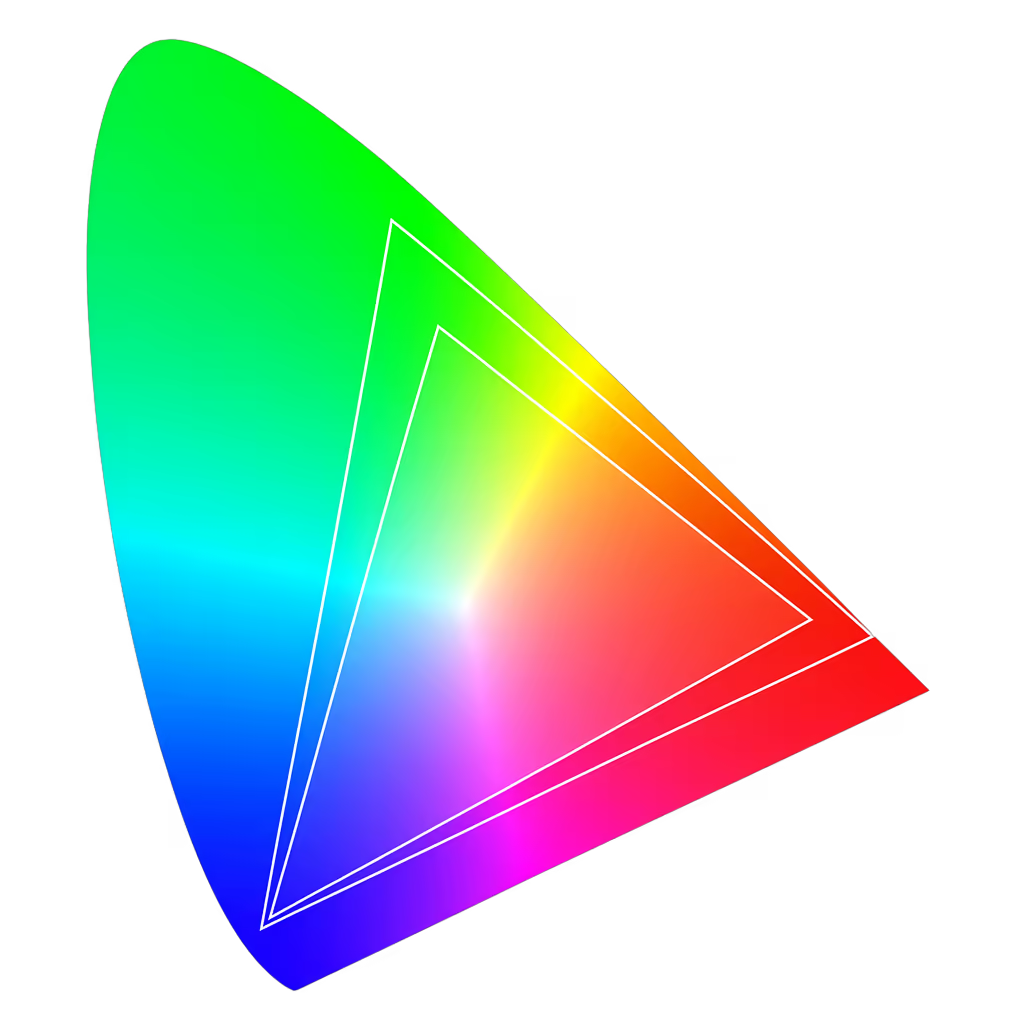
There is a lot more nuance when you get into color spaces. They don't just define a gamut, but also things like the white point and transfer function.
Structure
oklch, same as lch, consists of three values: Lightness, Chroma and Hue. The difference between the two is the underlying color space that the color model uses, which in case of OKLCH, is OKLab.
Lightness - Controls color brightness. Measured in values between 0 and 1 or percentage ranging from 0% to 100%.
Chroma - Controls intensity of the color, similar to saturation.
Hue - Controls the hue, measured in degrees ranging from 0 to 360.
Consistent brightness
Let's say you want to create a couple of buttons and you want each one to have a different color. The usual workflow with other color models would be defining the first color and then handpicking others to match it.
With oklch, you can use the same lightness value for all of them and only change hue. That way you create colors that look and feel the same.
You can do the same thing with color models like hsl, but as you can see above, the colors don't look uniform. Some are lighter, some darker, some pop more and some less.
This is one of the major advantages of oklch over other color models. Creating perceptually uniform color palettes and working with them is very easy.
Predictable shades
It also works the other way around, where you can change the lightness value to create various color shades and there is no hue or saturation drift unlike in other color modes.
In the example above, you can see that the oklch colors maintain consistent blueness across all of the shades, while in the hsl example, the lighter shades drift to purple and the darker ones muddy out towards grayish.
Gradients
The way gradients work in oklch is pretty different compared to other color models. In other color models, gradients are calculated in red, green, and blue values, which often leads to muddy midpoints and uneven brightness.
In oklch, the math follows lightness, chroma, and hue. In the example above you can see that the starting and ending points are the same but the colors the gradient passes through are quite different.
This can be a double edged sword. While some gradients might look smoother, you might also see colors that you've never defined. This is because hue in oklch is circular and gradients can take unexpected detours.
To avoid this, many tools use oklab for gradients instead, because it interpolates in a straight line and gives more consistent results.
Color space support
The sRGB gamut can't reach a lot of colors that modern screens can show. In oklch you can write colors that are only possible to render on a screen that supports Display-P3 colors.
If your display supports Display-P3, you will see the right colors more vivid than the left ones. If your display only supports sRGB, the colors should look nearly identical, as the browser maps the out of gamut color back inside the sRGB gamut.
Keep in mind that grays are identical in sRGB and Display-P3, so there would be no difference there.
Maximum chroma
oklchcan also define more colors than any real screen can show. It can specify values that don't fit inside any actual gamut like sRGB or Display-P3.
Let's take this color as an example color: oklch(0.7 0.4 40). It has a very high chroma value and it could mathematically exist but in practice it lies outside of any real display's gamut.
When this color is used, it will get clipped or mapped to the nearest representable color inside the gamut.
@layer base {
  :root {
    color: oklch(0.7 0.4 40);
  }
}
Generally you don't want this to happen, as the clipped color can often look very different from the defined one.
Therefore, there is a concept of a maximum chroma value, which calculates the maximum chroma that a display can show based on the lightness, hue and the selected gamut.
Browser support & fallbacks
oklch colors were introduced in CSS Color Module Level 4 and they are well supported across all modern browsers.
However, there are still some surfaces where oklch colors are not supported such as outdated browsers. In case you are worried about this, you can add fallbacks and use the @supports directive in CSS.
@layer base {
  :root {
    /* sRGB hex */
    --color-gray-50: #fcfcfc;
    --color-gray-100: #f9f9f9;
    --color-gray-200: #f0f0f0;

    @supports (color: oklch(0 0 0)) {
      /* OKLCH */
      --color-gray-50: oklch(0.991 0 0);
      --color-gray-100: oklch(0.982 0 0);
      --color-gray-200: oklch(0.955 0 0);
    }
  }
}
This way the browser uses oklchif the syntax is supported, otherwise it falls back to sRGB. Keep in mind that this doesn't magically change the colors. If an oklch color fits inside the sRGB gamut, it will look the same as the equivalent hex color.